A color chart for clothes is most useful when it helps with the familiar morning problem: two perfectly good pieces look oddly unrelated once they are on your body. The chart is not a rulebook for dressing in rainbow order. It is a quick way to notice temperature, depth, and contrast before a promising outfit becomes busy or flat.
Read a color chart as a map for real clothes
The color wheel puts hues beside their close relatives and opposite their strongest contrast. In a wardrobe, that means olive usually settles easily beside moss, khaki, camel, navy, and faded denim, while olive with bright fuchsia makes a much louder statement. Neither pairing is wrong; they simply ask for different amounts of confidence and simpler supporting pieces. Start by naming the color you actually own, not the ideal color in a diagram. A dusty rose blouse behaves differently from a hot pink sweater, even though both may be called pink.
Build the outfit around dependable neutrals
Then look at value, meaning how light or dark a color appears. A pale blue shirt with charcoal trousers often feels composed because the values are clearly separated. A mid-blue knit with mid-grey trousers can work too, but it needs a deliberate detail such as white sneakers, a dark belt, or a visible collar. When two colors have nearly the same depth but unrelated undertones, the outfit can look accidental. A color chart gives you a useful pause: are these colors related, contrasted, or merely sitting together?
Use related colors when you want an easy answer
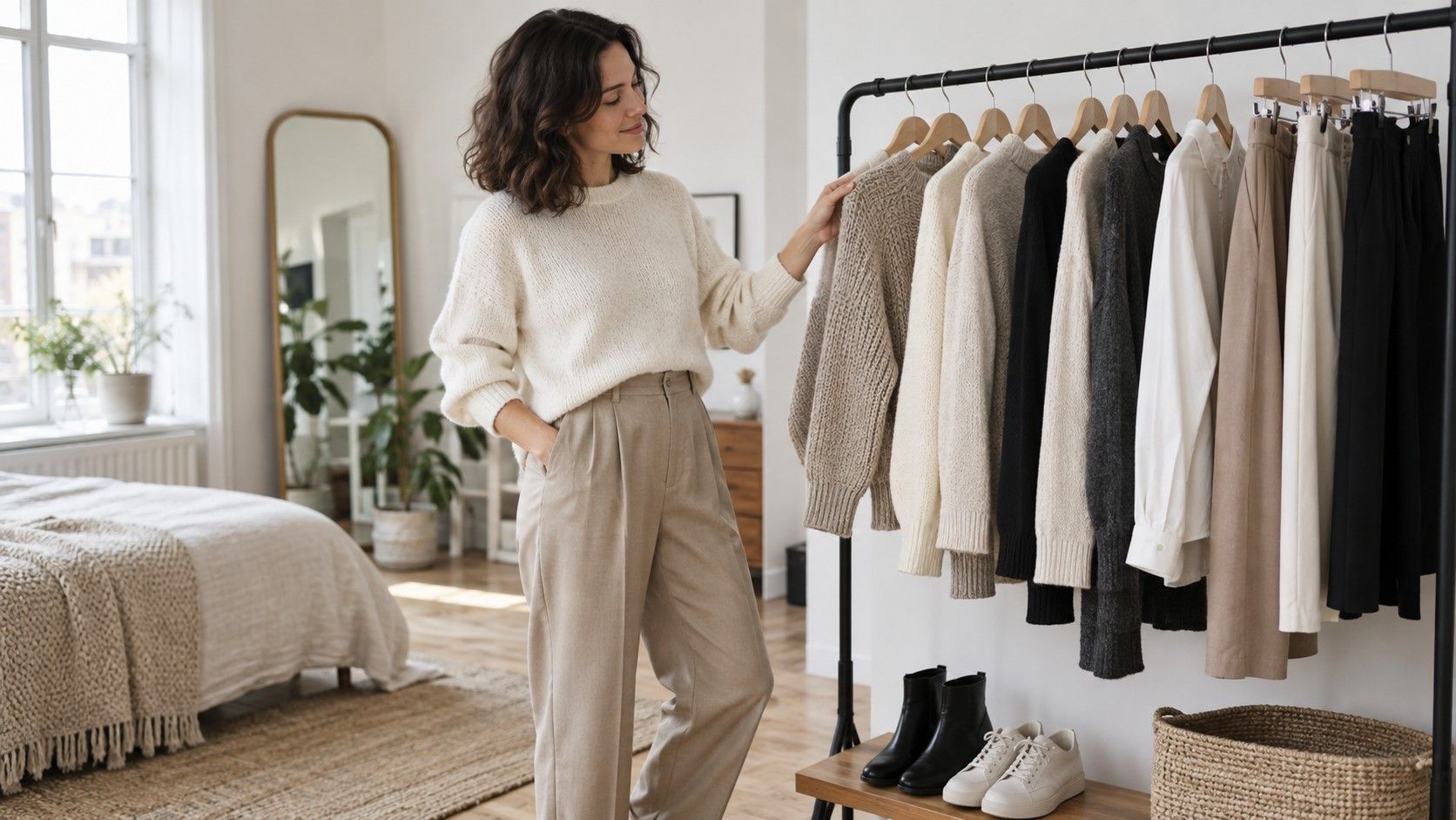
Neutrals are the quiet working surface of clothing color combinations. Black, charcoal, navy, white, cream, stone, chocolate, and denim are not interchangeable, despite being treated that way in many wardrobe checklists. Black has a sharp, urban edge; cream softens warm colors; navy usually makes red, green, and burgundy look calmer; chocolate is often friendlier to muted autumn shades than cool grey. Try holding an item next to your trousers or jacket in daylight rather than judging it beneath a changing-room spotlight.
Choose two or three neutrals that already suit your routine. Someone who wears dark jeans, tan boots, and a navy coat has an easier time adding ecru, rust, forest green, and faded blue than someone whose base is black tailoring and bright white sneakers. The point is not to own every neutral. It is to make sure new purchases can meet at least two existing anchors. That small check stops the isolated purchase that looks wonderful on a hanger and then waits months for a compatible partner.
Analogous colors sit next to one another on the wheel: blue with blue-green, burgundy with plum, camel with rust. They are useful on rushed days because they create movement without demanding a precise match. A slate-blue shirt, dark denim, and a muted green overshirt can look coherent even when the fabrics are different. Keep one item quieter if the colors are all visible near the face. The outfit should have a clear resting place for the eye, usually the trouser, shoe, or outer layer.
Saturation matters as much as hue. A soft sage sweatshirt and a faded indigo jean share a muted finish, while the same sweatshirt with an electric cobalt bag may feel like two separate wardrobes collided. If you like a brighter piece, pair it with washed denim, cream, or a dark neutral rather than adding a second bright color immediately. This is where the three-color rule can help: count the dominant visible colors, then let hardware, socks, and tiny prints act as details instead of new main characters.
Add contrast without creating visual noise
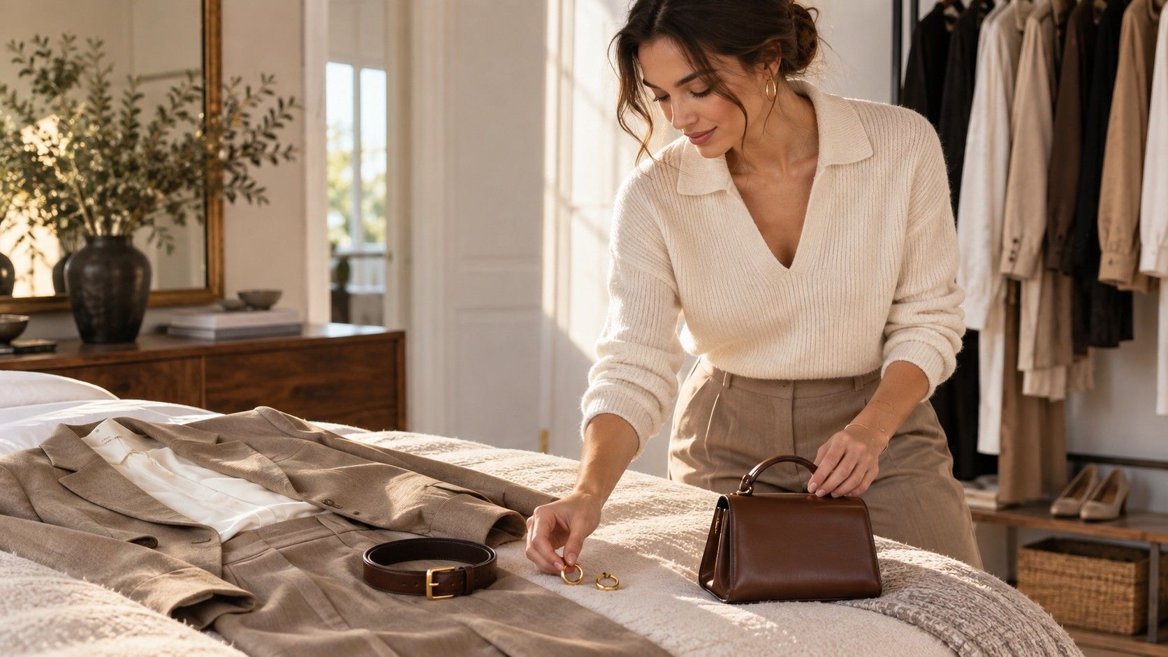
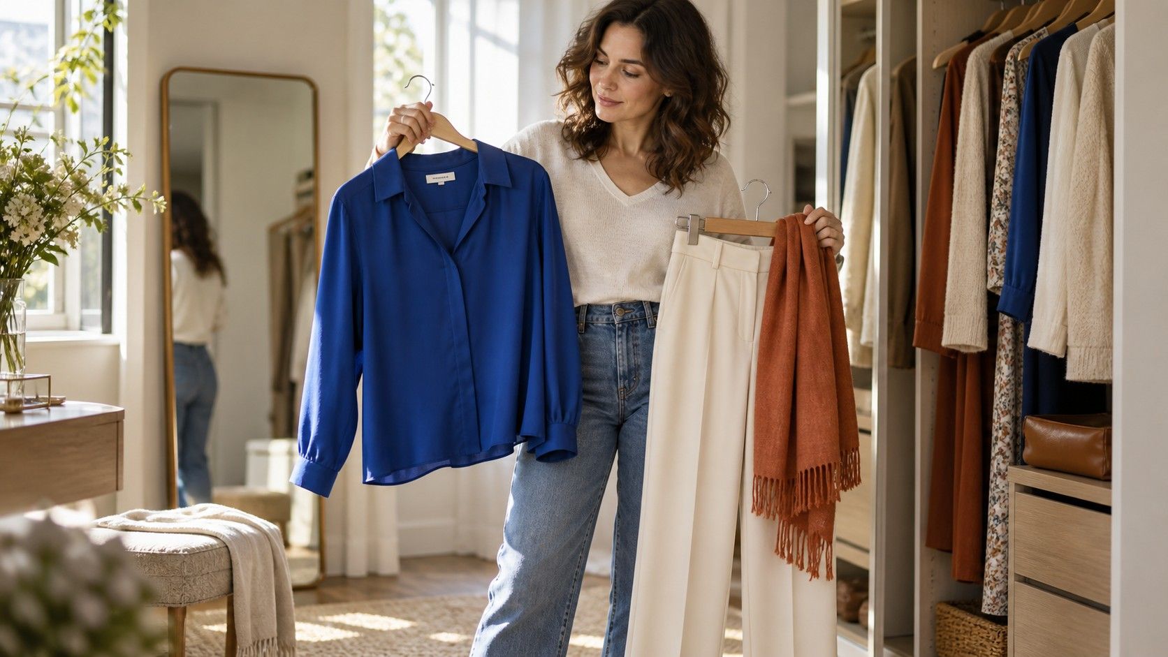
Opposite colors on a color chart create energy: blue and orange, purple and yellow, red and green. In daily clothes, the most wearable version is rarely equal blocks of both. Use one color as the main field and the other as an accent. Navy trousers and a pale blue shirt can take a warm cognac belt or rust scarf. A deep green dress can be lifted by oxblood shoes. The contrast is still there, but it does not arrive before you do.
Contrast can also come from light and dark rather than hue. A black tee, light-wash jeans, and white trainers are built almost entirely on value contrast. This is useful if you dislike colorful outfits but still want definition. When an outfit seems unfinished, ask whether everything is equally dark, equally pale, or equally saturated. Adding a lighter sock, a darker jacket, or a textured brown shoe often solves the problem more cleanly than buying another colorful accessory.
Match warm and cool undertones near your face
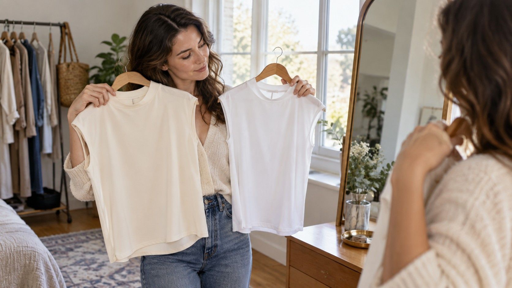
A color chart cannot replace a mirror, especially for tops, scarves, and coats. Cool colors usually contain more blue or grey; warm colors lean yellow, orange, or red. Yet the practical question is not whether your skin has been assigned a permanent season. It is whether a garment makes your complexion look clearer, tired, sallow, or suddenly more even in ordinary window light. Compare two versions of a color near your face: optic white against cream, blue-red against tomato red, cool pink against coral.
Do the comparison without heavy makeup and without relying on a phone screen that changes exposure. Take a photo by a window if you want a record, but look first at your under-eye area, jawline, and the contrast of your features. A shade that is slightly too warm or cool does not need to leave the wardrobe. Wear it farther from the face as trousers, a skirt, shoes, or a bag, then bring a more flattering neutral up to the neckline.
Fix the outfit that almost works
When colors feel wrong, resist changing everything. First remove one competing element: the bright shoe, printed scarf, or extra layer. Next, identify the dominant color and give it a companion rather than another rival. A navy blazer over a black top can seem severe until cream trousers or medium-blue denim create a bridge. A beige sweater with pale jeans may look washed out until a dark brown loafer, belt, or jacket introduces needed depth.
Keep a small note on your phone with combinations that worked in real life: navy plus cream plus cognac, charcoal plus soft blue plus white, olive plus denim plus tan. This becomes a personal color chart for clothes, based on your lighting, laundry habits, and preferred silhouettes. The best outfit palette is not the one with the most theory behind it. It is the set of combinations you can repeat without standing in front of the closet negotiating with every hanger.
| Outfit goal | Useful color approach | Simple example |
|---|---|---|
| Quiet and polished | Two neutrals with one soft accent | Navy, cream, muted burgundy |
| More definition | Light-dark value contrast | White shirt, charcoal trousers, black shoes |
| Colorful but easy | Related muted hues | Sage knit, indigo denim, tan boots |
| Noticeable accent | One restrained complementary detail | Blue outfit with a rust bag or cognac belt |