A clothing color test does not need a consultant, a dramatic makeover, or a drawer full of new scarves. It starts with a more useful question: which colors make your face look awake on an ordinary Tuesday, and which ones make a good night's sleep seem fictional? A careful comparison at home can give you answers that are far more useful than a label from a quiz.
Set up a test you can trust
Choose a time with steady daylight, ideally near a north-facing or softly shaded window. Direct sun is flattering to nearly everyone for about thirty seconds and then creates hard shadows that hide the difference between colors. Turn off overhead lamps if they are very yellow or very blue. Wear a plain top or drape a neutral towel around your shoulders so the color you are testing has room to speak.
Compare colors at the neckline, not from arm's length
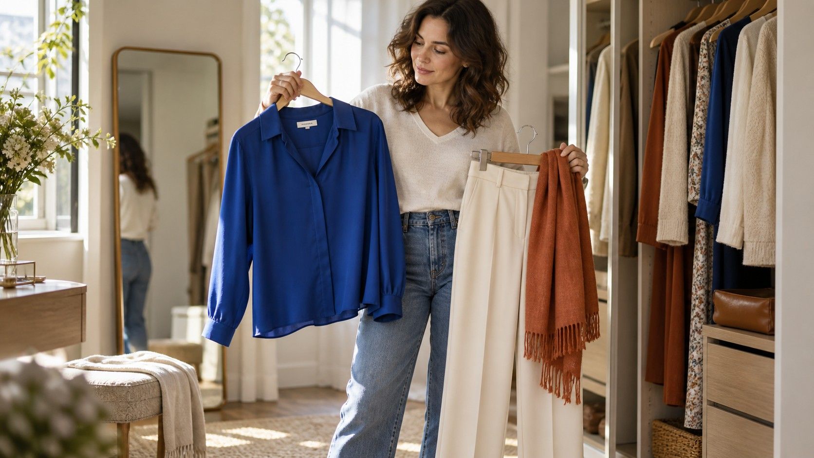
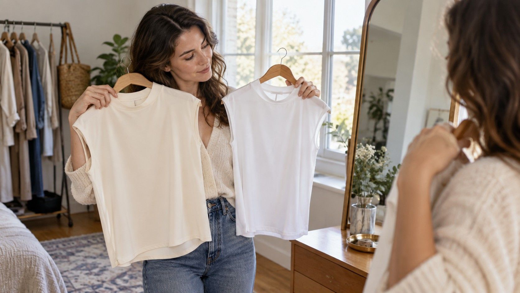
Gather garments, scarves, sheets, or fabric scraps in several versions of the same family. A white shirt and a cream tee are useful; so are navy and cobalt, coral and cool pink, olive and emerald. The fabric does not need to be expensive. A color test for clothes is about reflected light near your face, not about building a perfect collection of drapes. Keep your hair back if it is strongly colored, and remove tinted glasses that may change what you see.
Check depth before you debate undertones
Place one color beneath your chin, then replace it with another and look at the transition. The winning shade often makes the skin around the mouth and eyes look more even, while an awkward shade brings out redness, grey shadows, or a yellow cast. Do not expect a movie-star transformation. The useful difference is usually quieter: one top lets your features arrive first, while the other seems to enter the room before you do.
Necklines matter because the same color can behave differently depending on how much skin it frames. A warm mustard crewneck may be overwhelming, but the same mustard in trousers can be excellent. A deep navy V-neck may be easier than a high-neck navy knit because the open space softens the contrast. If a color is almost right, test it with a white collar, a cream scarf, or a different neckline before deciding it is permanently off limits.
People often jump straight to warm versus cool undertones, yet depth is frequently the easier problem to spot. Hold pale, medium, and deep versions of a color beside your face. Someone with dark brows and eyes may look sharper in ink navy, deep teal, or chocolate than in washed pastel versions. Someone with low overall contrast may find that soft blue, sage, mushroom, and muted rose feel gentler than black and icy white.
Depth is not a personality test and it does not ban bright colors. It simply tells you how much contrast your features can comfortably carry. If black makes your face disappear while charcoal works, the issue may be intensity rather than a supposedly incorrect undertone. Try dark brown, navy, soft black, and charcoal in the same test. Those results will help you choose coats, knitwear, and dresses more reliably than chasing one perfect seasonal palette.
Use phone photos as a record, not the final judge
Phone photos can reveal a pattern when your memory gets unreliable, but cameras are easily fooled by windows, mirrors, and auto-exposure. Stand in the same place, keep the camera at the same height, and photograph each comparison without filters or portrait mode. Label the images simply: cream versus white, rust versus berry, olive versus teal. Looking at the sequence later often makes the weaker colors obvious.
Still, check the mirror first. A phone may brighten a dark top or cool down a warm room, while your own eyes can see whether you look healthy, alert, and recognizably yourself. If you wear makeup, repeat a few comparisons on a low-makeup day; foundation and lipstick can make almost any fabric seem temporarily cooperative. The aim is not to prove a color theory. It is to find shades that work under the conditions in which you actually get dressed.
Test your existing wardrobe before buying a new palette
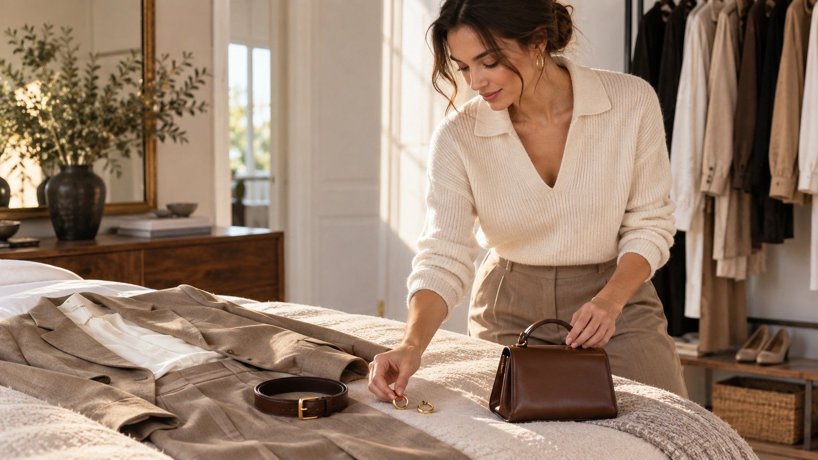
Lay your frequently worn tops, jackets, and dresses on the bed and sort them into three groups: easy near the face, workable with styling, and consistently disappointing. The last group is informative. Perhaps every pale beige blouse makes you look faded, or every very bright jewel tone feels louder than you want. That does not mean those colors are bad. It means your wardrobe has already been running a long, unpaid experiment.
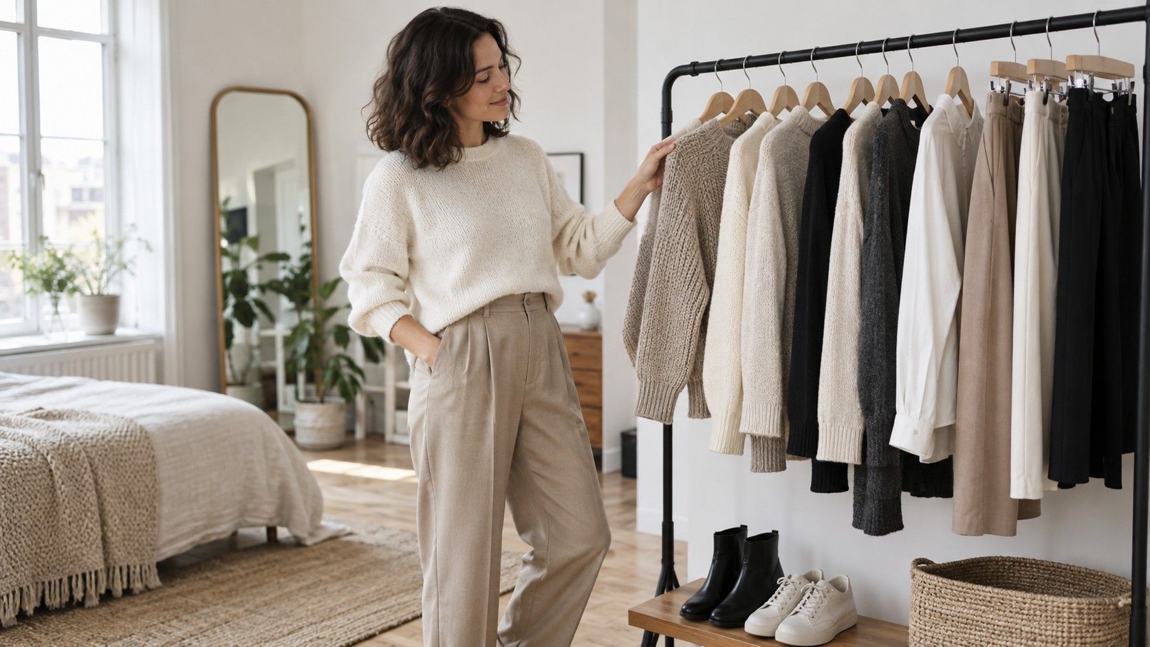
Look for repeated wins across categories. If faded denim blue, soft white, forest green, and burgundy all work, your clothing color test may point toward medium-to-deep, slightly muted shades rather than one strict temperature. Then see whether those colors cooperate with your trousers and outerwear. A flattering top that clashes with every coat creates its own kind of decision fatigue. The most useful palette fits both your face and the pieces you need to wear five days a week.
Turn the results into better shopping decisions
Write down a short shopping filter rather than a grand identity: deep soft blues, cream instead of stark white, muted warm reds, charcoal rather than black near the face. Keep it in your notes app and consult it when an online product photo starts making promises. Online color names are unreliable, so compare the listed shade with the product's close-up fabric image and imagine it beside your known neutrals.
When you try on a possible purchase, take it to a window and compare it with a color you already know works. Ask three practical questions: does it make my face look clearer, does it pair with two things at home, and do I like it without needing a complicated explanation? The answer to what color clothes look best on me is rarely one dramatic shade. It is a small group of repeatable choices that remove friction from getting dressed.
| Comparison | What to watch for | Useful conclusion |
|---|---|---|
| White versus cream | Under-eye shadows and skin warmth | Choose the version that makes the face look more even |
| Black versus charcoal | Feature definition versus harshness | Use charcoal near the face if black dominates it |
| Bright versus muted blue | Whether fabric arrives before your features | Match saturation to the level you can wear easily |
| Light versus deep red | Contrast around brows, eyes, and jawline | Use the depth that gives shape without looking heavy |